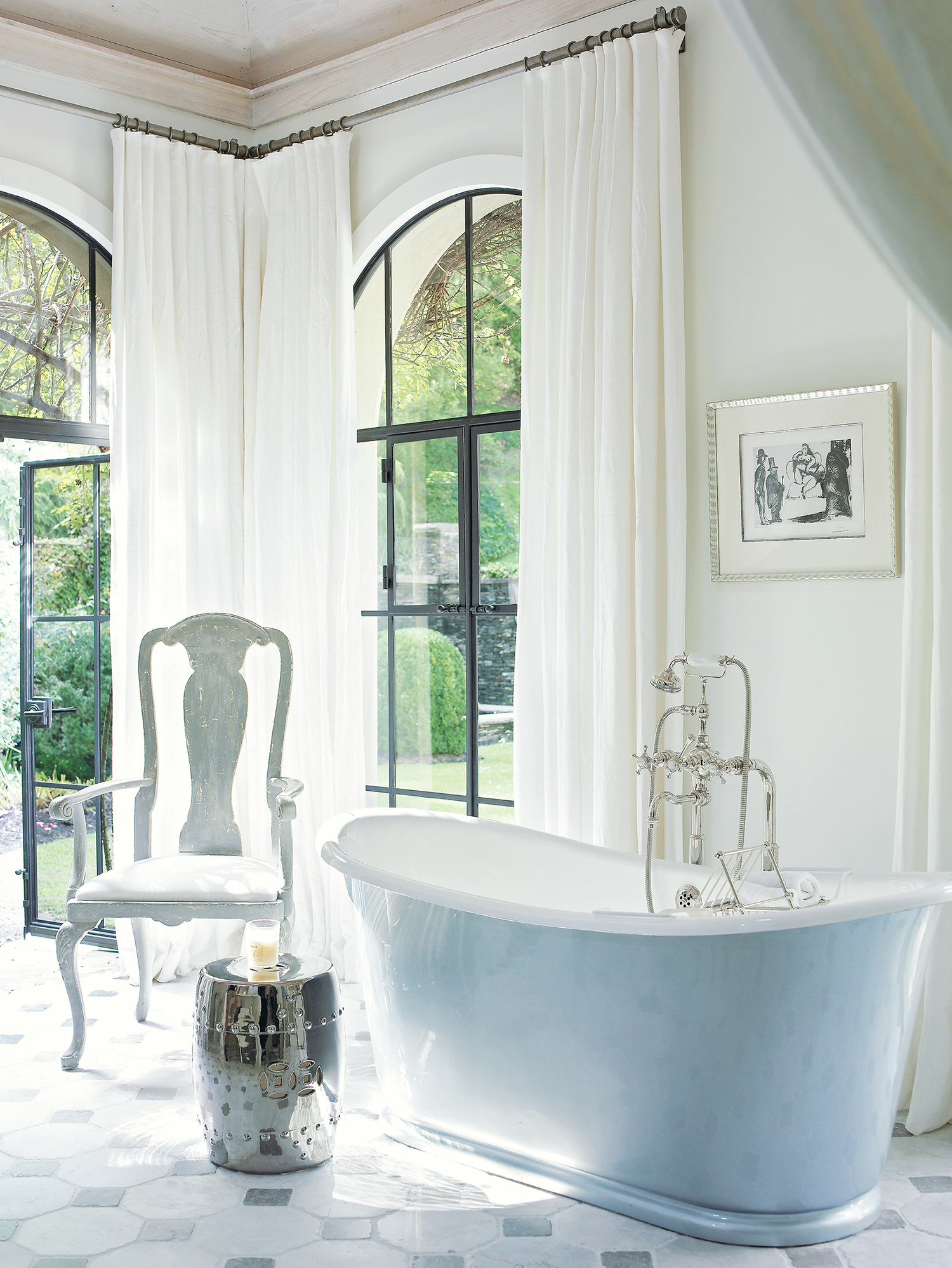
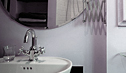
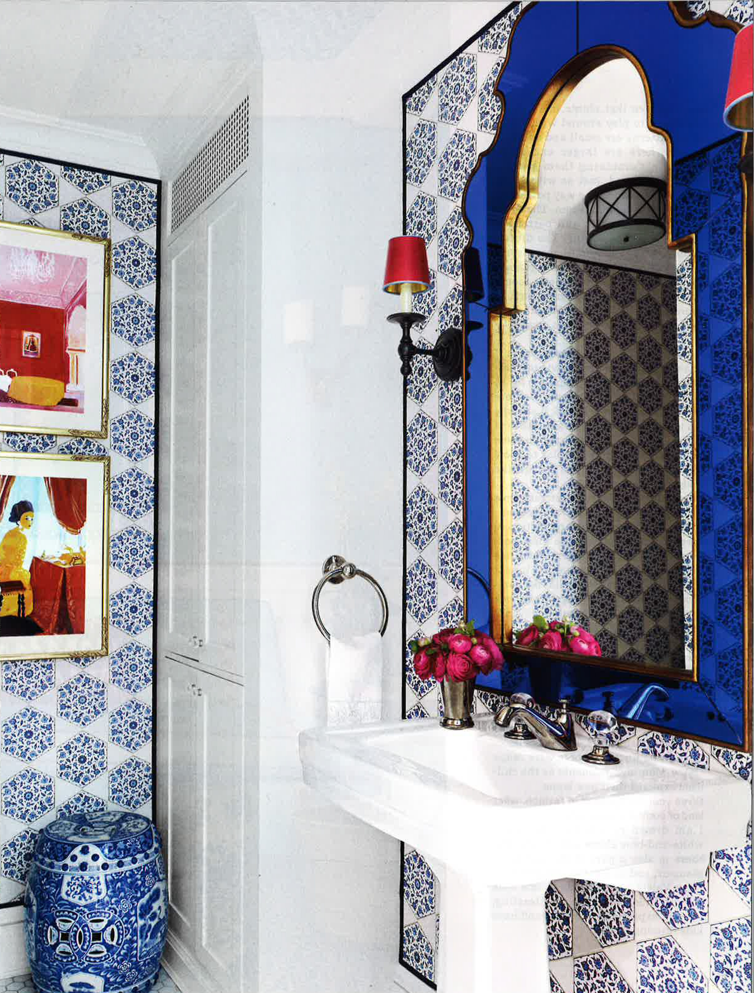
Tag Archives: palette

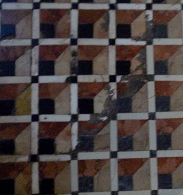
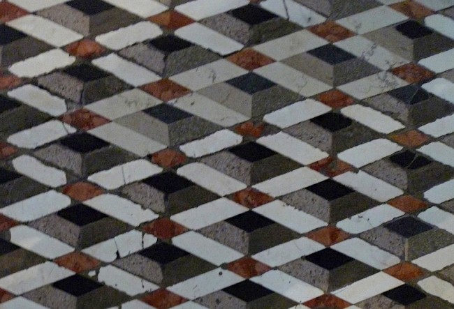
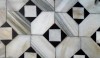
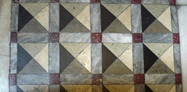
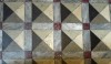
We have been talking about a gentle shift in bath design for about a year. It started with the launch of our new Architectonics palette (expanded to 123 colors) and has continued to the installation of more active and colorful stones.

  /     /     /     /     /  
0

As I continue to share images from The Perfect Bath, I want to be sure I touch on the many different expressions of the word “perfect”. The spaces can be small and intimate or grand. They can be clad in actively figured marble or simple white subway tile. The bath can have decorative chandeliers or functional high hats. But, the most important thing about a perfect bath is how it makes you feel; you need to define the the refreshing and relaxing experience of your dreams.

  /     /     /     /     /  
0

Industrial design has hit a new high for American interiors. We see it in everything from lighting in restaurants and hotels to hardware on furniture and cabinetry to Waterworks faucets for the bath, bar and kitchen. To further this desired style, the industrial-inspired R.W. Atlas collection was designed for us by Roman and Williams and feels very current.

  /     /     /     /     /     /     /  
0

I simply love mosaics–from the earliest ones I’ve seen at Ephesus, Herculaneum, St. Mark’s and other Venetian churches, to the charming creations in the foyer of early 20th century Paris apartment buildings as well as modern interpretations of any of these designs. I always look for elegant cuts, artful arrangements and placement of the tesserae, the tonal value of the palette and the skill of the artisans. The beauty of mosaics is in the detail. Whether simple black and white or multi colored, mosaics use thousands upon thousands of small and precious tiles to tell their stories, assessing the effect of light and shade or exploiting complementary colors.

  /     /     /     /     /     /     /     /  
0